ggplot(ames_df) +
  geom_point(aes(x=Gr.Liv.Area, y=SalePrice))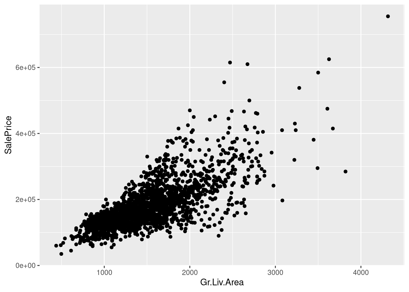
\(\,\)
We have defined \(\Yhat = \X \betavhat\), and shown that \(\Yhat = \proj{X} \betavhat = \X (\X^\trans\X)^{-1}\X^\trans \Y\). We can call
\[ \begin{aligned} \Yhat^\trans \Yhat :={}& ESS = \textrm{"Explained sum of squares"} \\ \Y^\trans \Y :={}& TSS = \textrm{"Total sum of squares"} \\ \resvhat^\trans \resvhat :={}& RSS = \textrm{"Residual sum of squares"}. \end{aligned} \]
In your homework, you will show that \(TSS = ESS + RSS\). It follows immediately that \(0 \le ESS \le TSS\), and we can define \[ R^2 := \frac{ESS}{TSS} \in [0, 1]. \]
In a sense, high \(R^2\) means a “good fit” in the sense that the least squares fit has low error.
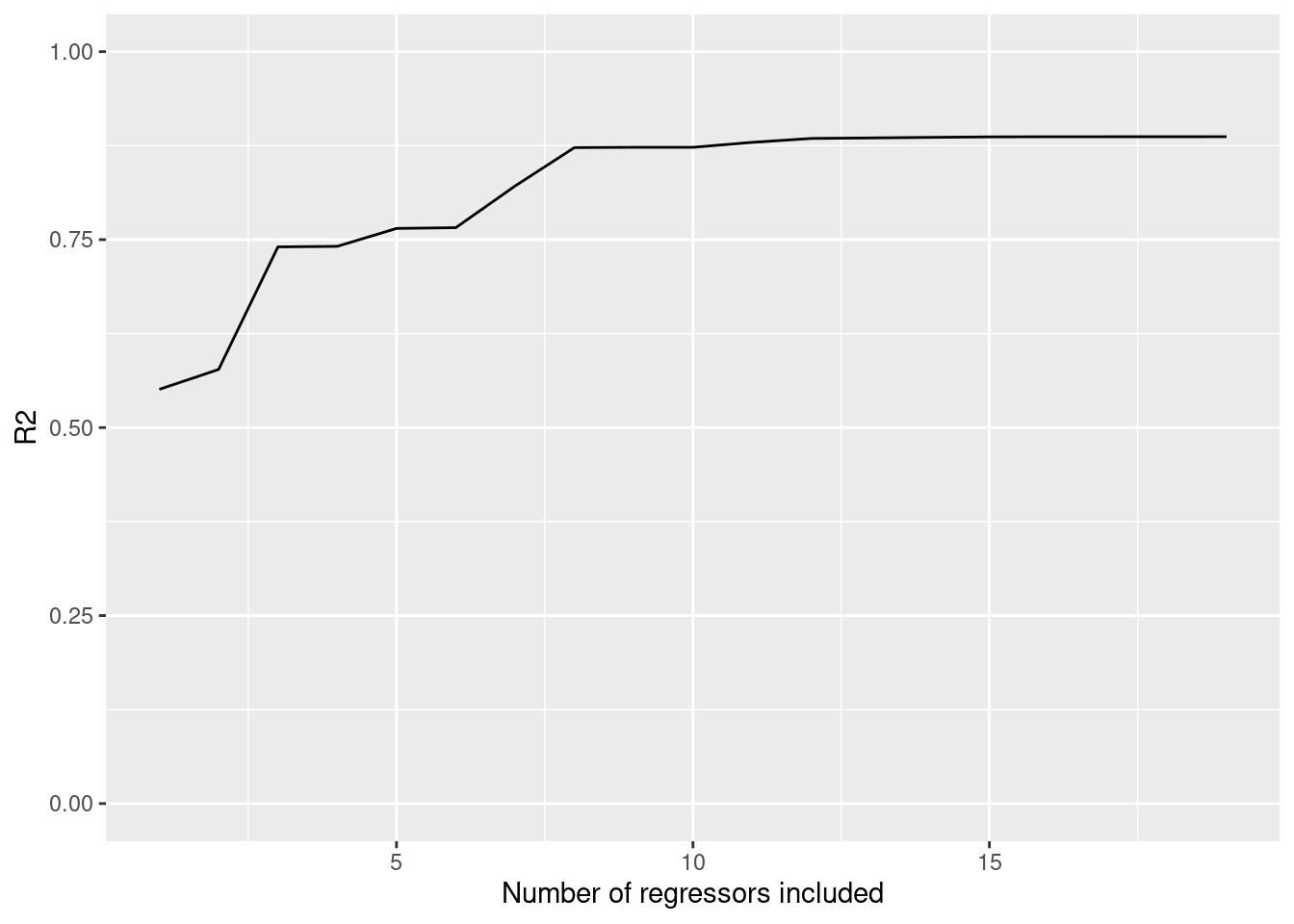
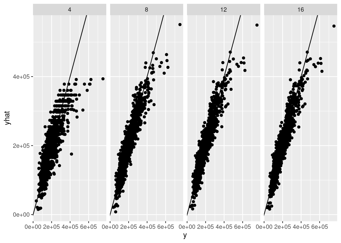
But high \(R^2\) does not necessarily mean that the fit is accurate or useful! In particular, by increasing the number of regressors, you can only make \(R^2\) increase, and there are clearly silly regressions with great \(R^2\).
Here are two examples:
Today we will look at the effect of regressors on \(R^2\), and how to make new regressors from the ones you have. We will also talk about how to interpret such “interaction” regressors.
Let’s try to predict SalePrice using the regressors in the Ames dataset. We’ll explore some different ways to include more regressors.
ggplot(ames_df) +
geom_point(aes(x=Gr.Liv.Area, y=SalePrice))
regs <- c("Neighborhood", "Bldg.Type", "Overall.Qual", "Overall.Cond",
          "Exter.Qual", "Exter.Cond",
          "X1st.Flr.SF", "X2nd.Flr.SF", "Gr.Liv.Area", "Low.Qual.Fin.SF",
          "Kitchen.Qual",
          "Garage.Area", "Garage.Qual", "Garage.Cond",
          "Paved.Drive", "Open.Porch.SF", "Enclosed.Porch",
          "Pool.Area", "Yr.Sold")

if (any(!(regs %in% names(ames_df)))) {
  print(setdiff(regs, names(ames_df)))
}
I’ll run a bunch of regressions, including more and more regressors, and see what happens.
reg <- lm(SalePrice ~ Gr.Liv.Area, ames_df)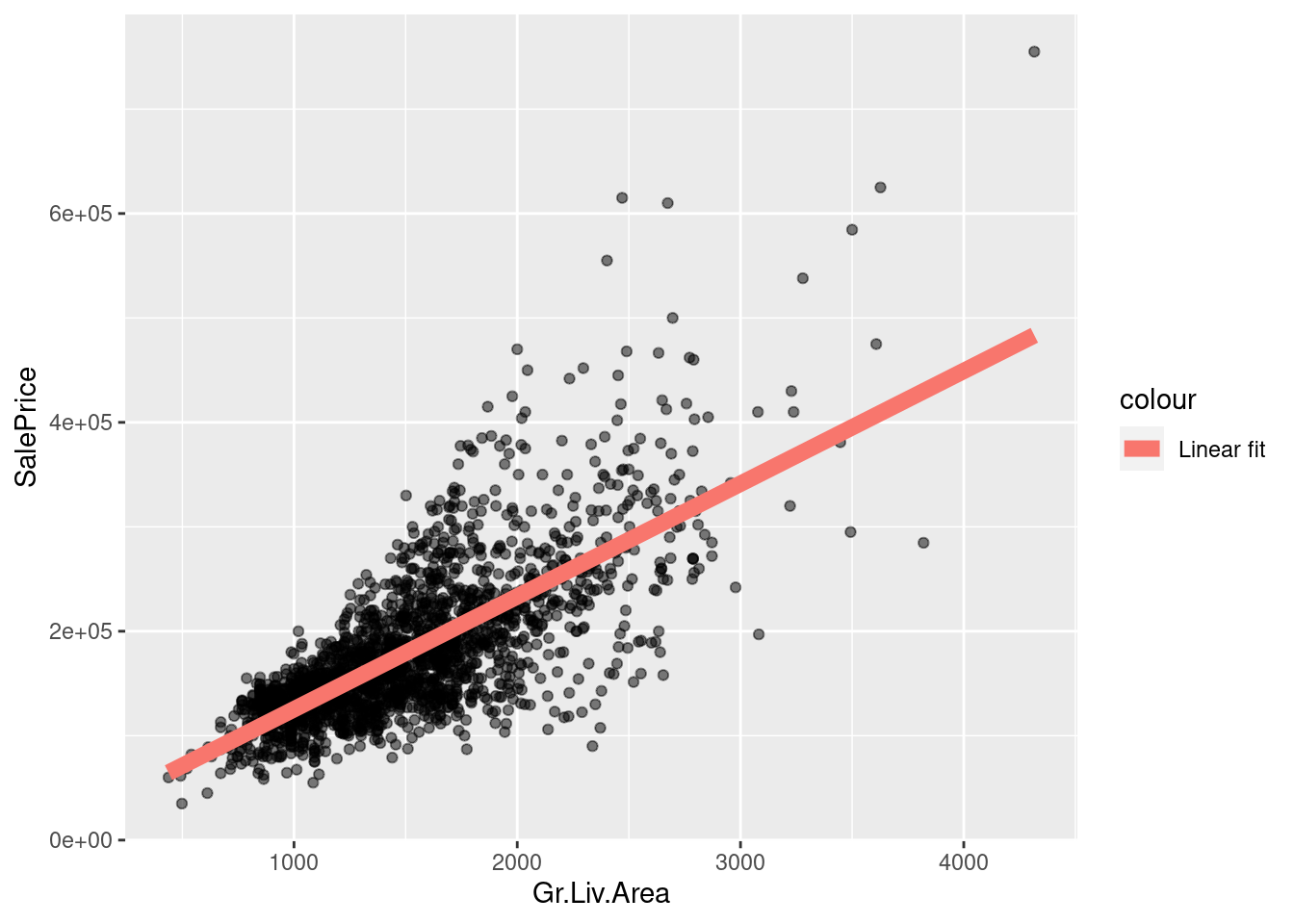
It looks like there may be non-linear dependence. How can we fit a nonlinear curve with “linear regression”?
reg_sq <- lm(SalePrice ~ Gr.Liv.Area + I(Gr.Liv.Area^2), ames_df)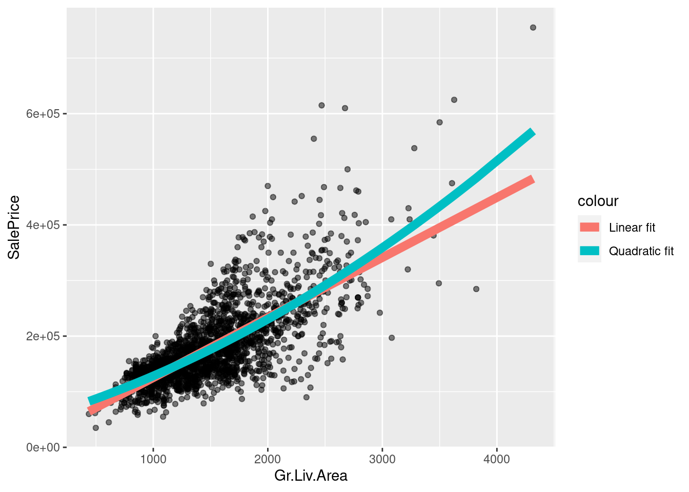
It looks like there may be non-linear dependence. How can we fit a nonlinear curve with “linear regression”?
reg_order1 <- lm(SalePrice ~ Gr.Liv.Area, ames_df)
reg_order2 <- lm(SalePrice ~ Gr.Liv.Area + I(Gr.Liv.Area^2), ames_df)
reg_order3 <- lm(SalePrice ~ Gr.Liv.Area + I(Gr.Liv.Area^2) + I(Gr.Liv.Area^3), ames_df)
reg_order4 <- lm(SalePrice ~ Gr.Liv.Area + I(Gr.Liv.Area^2) +
                 I(Gr.Liv.Area^3) + I(Gr.Liv.Area^4), ames_df)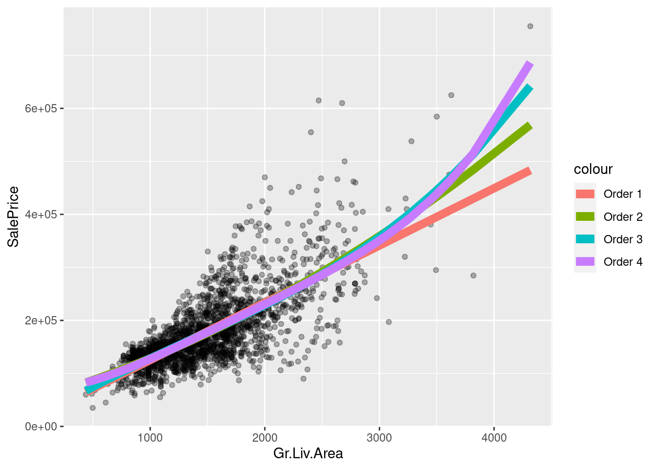
What will happen if you regress on higher and higher-order polynomials? How do you decide when to stop?
The poly function does the same thing more compactly. It also uses “orthogonal polynomials,” which can help fitting.
reg_order4 <- lm(SalePrice ~ Gr.Liv.Area + I(Gr.Liv.Area^2) +
                 I(Gr.Liv.Area^3) + I(Gr.Liv.Area^4), ames_df)

reg_order4_v2 <- lm(SalePrice ~ poly(Gr.Liv.Area, 4), ames_df)
print(max(abs(fitted(reg_order4) - fitted(reg_order4_v2))))
[1] 6.984919e-10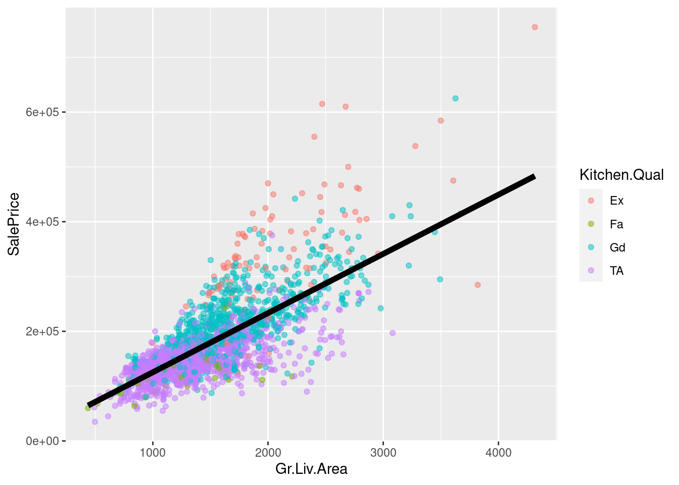
Recall that we found some grouping by kitchen quality. Let’s include the indicator in the regression:
reg_additive <- lm(SalePrice ~ Gr.Liv.Area + Kitchen.Qual, ames_df)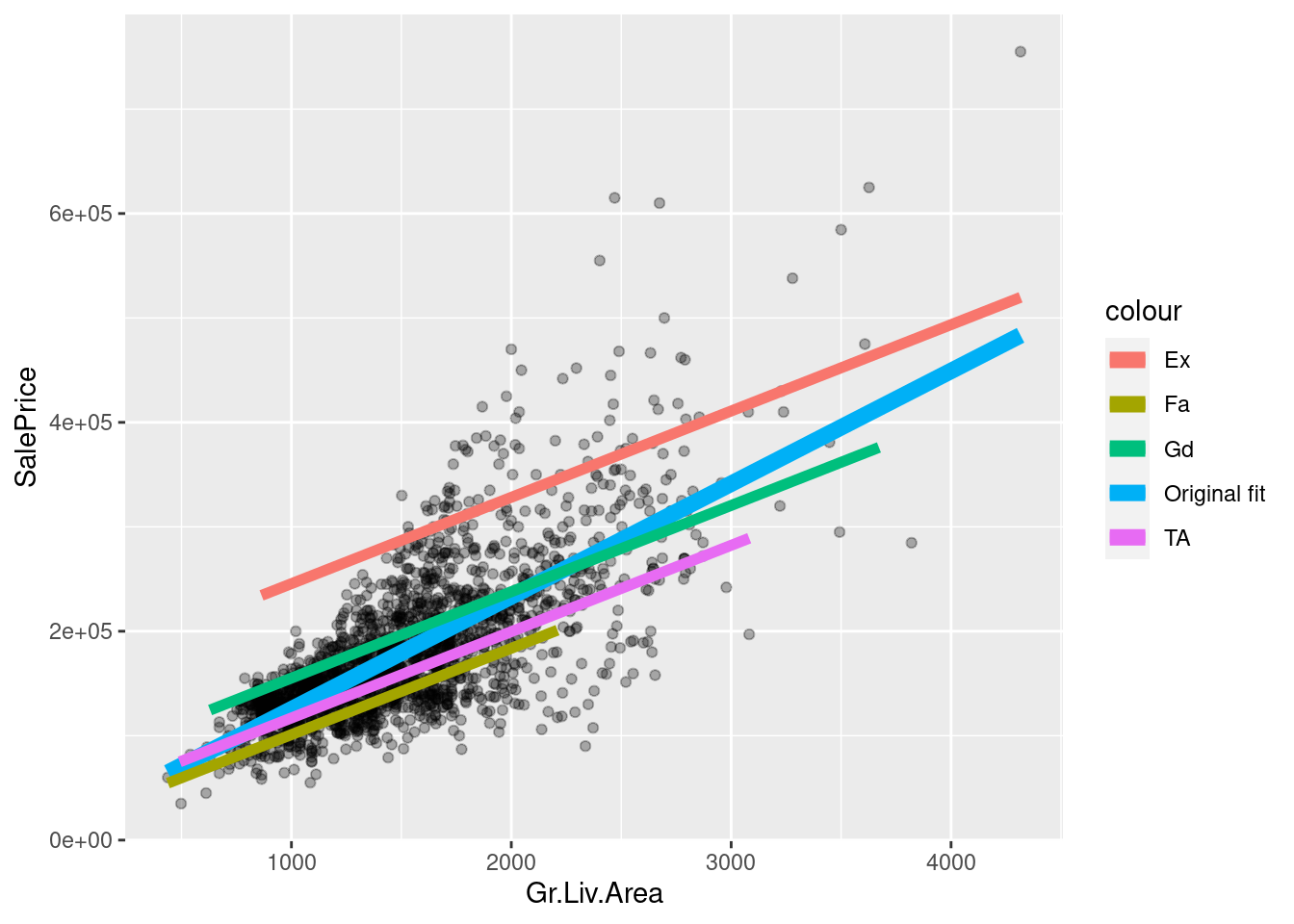
The fit is now different for each kitchen quality, and the overall slope changed too!
However, the slope is still the same within each kitchen quality group. Why?
We can see in the XTX matrix that there is some association between living area and kitchen quality.
How would we expect the slope to have changed if this matrix were diagonal?
x <- model.matrix(reg_additive) %>% scale(center=FALSE)
xtx <- t(x) %*% x / nrow(ames_df)
PlotMatrix(xtx)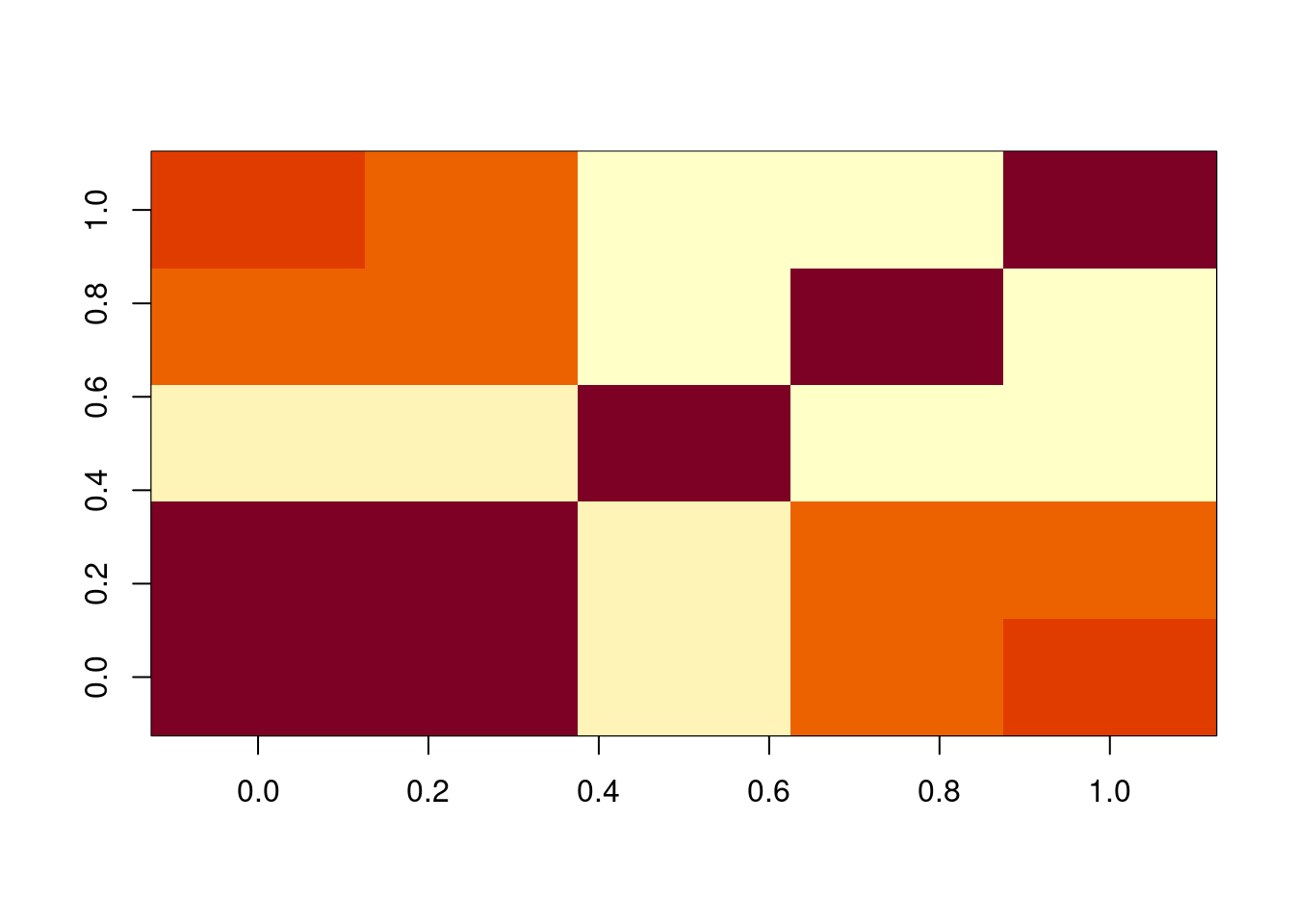
Note that one of the levels is automatically dropped? Why?
table(ames_df$Kitchen.Qual)
  Ex   Fa   Gd   TA
108 42 844 1197 print(coefficients(reg_additive)) (Intercept) Gr.Liv.Area Kitchen.QualFa Kitchen.QualGd Kitchen.QualTA
162906.94088 82.67511 -144558.98868 -90449.59019 -128625.75269 How would you fit a different slope for each kitchen quality? Use an interaction term. You can use the R notation : and it will construct the interaction automatically for you.
reg_inter <- lm(SalePrice ~ Gr.Liv.Area:Kitchen.Qual, ames_df)
bind_cols(select(ames_df, Gr.Liv.Area, Kitchen.Qual),
          as.data.frame(model.matrix(reg_inter)))[1,] %>%
          t()
1
Gr.Liv.Area "1656"
Kitchen.Qual "TA"
(Intercept) "1"
Gr.Liv.Area:Kitchen.QualEx "0"
Gr.Liv.Area:Kitchen.QualFa "0"
Gr.Liv.Area:Kitchen.QualGd "0"
Gr.Liv.Area:Kitchen.QualTA "1656"Here’s a good cheat sheet for R formulas:
https://www.econometrics.blog/post/the-r-formula-cheatsheet/
x <- model.matrix(reg_inter) %>% scale(center=FALSE)
xtx <- t(x) %*% x / nrow(ames_df)
PlotMatrix(xtx)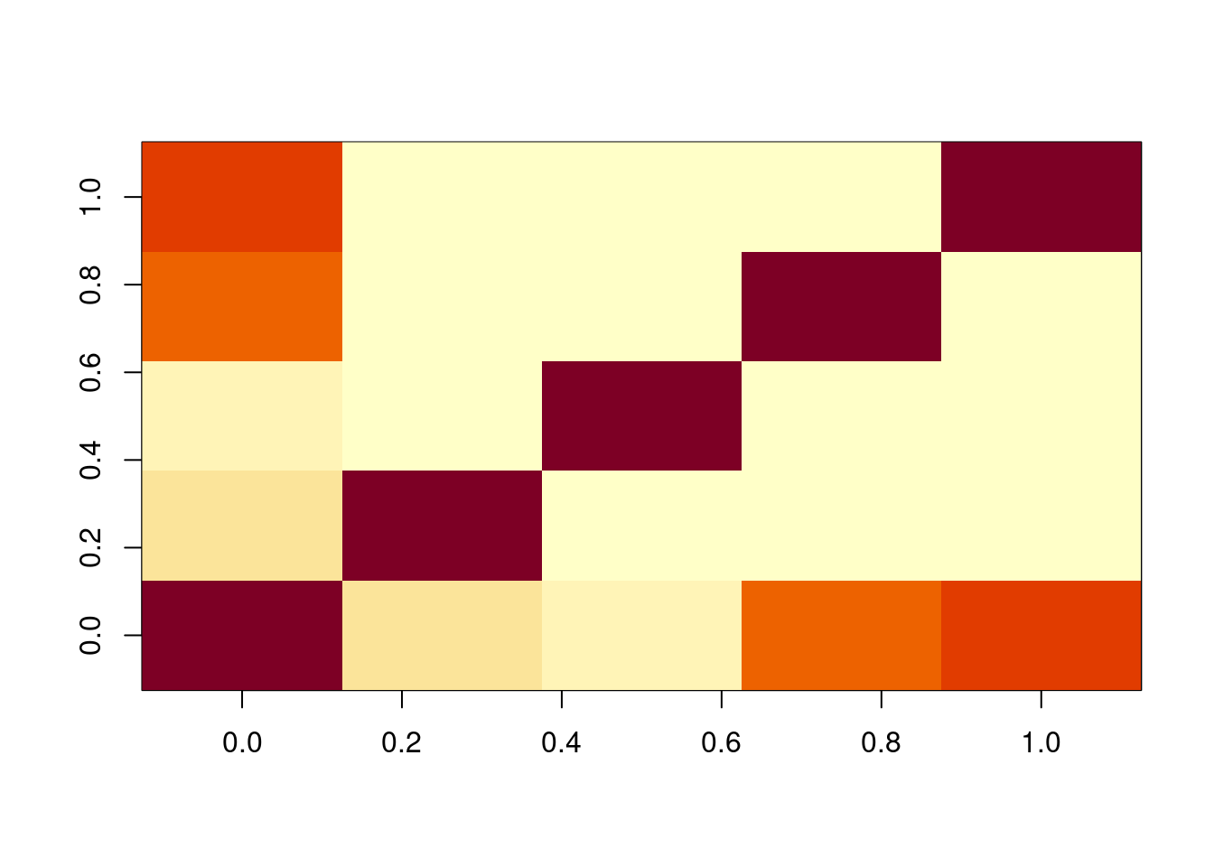
Is there a point where all the slope interaction lines cross?
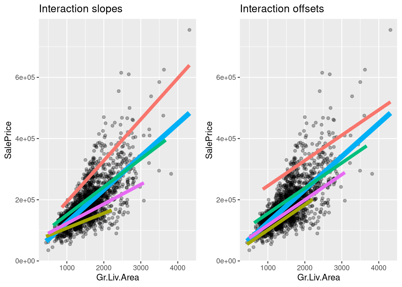
Using the R notation *, we can add both constant interactions and slope interactions:
reg_add_inter <- lm(SalePrice ~ Gr.Liv.Area*Kitchen.Qual, ames_df)
colnames(model.matrix(reg_add_inter))
[1] "(Intercept)" "Gr.Liv.Area"
[3] "Kitchen.QualFa" "Kitchen.QualGd"
[5] "Kitchen.QualTA" "Gr.Liv.Area:Kitchen.QualFa"
[7] "Gr.Liv.Area:Kitchen.QualGd" "Gr.Liv.Area:Kitchen.QualTA"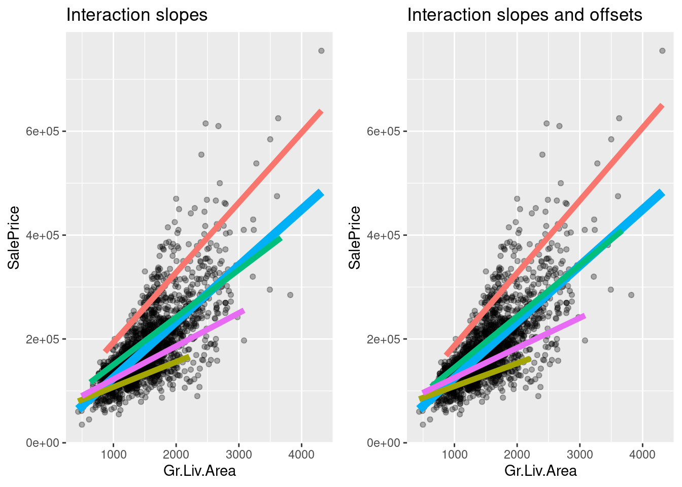
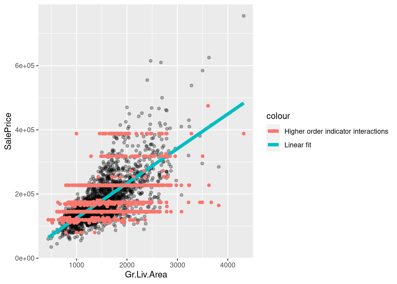
We can create still higher–order interactions with the symbol ^:
table(ames_df$Garage.Qual)
  Ex   Fa   Gd   Po   TA
3 101 19 3 2065 table(ames_df$Exter.Qual)
  Ex   Fa   Gd   TA
52 13 679 1447 table(ames_df$Kitchen.Qual)
  Ex   Fa   Gd   TA
 108   42  844 1197
reg_higher <- lm(
SalePrice ~ (Exter.Qual + Kitchen.Qual + Garage.Qual)^3,
ames_df)coeff_names <- names(coefficients(reg_higher))
cbind(coeff_names[1:5], coeff_names[21:25], coeff_names[71:75]) [,1] [,2]
[1,] "(Intercept)" "Exter.QualFa:Garage.QualFa"
[2,] "Exter.QualFa" "Exter.QualGd:Garage.QualFa"
[3,] "Exter.QualGd" "Exter.QualTA:Garage.QualFa"
[4,] "Exter.QualTA" "Exter.QualFa:Garage.QualGd"
[5,] "Kitchen.QualFa" "Exter.QualGd:Garage.QualGd"
[,3]
[1,] "Exter.QualTA:Kitchen.QualTA:Garage.QualPo"
[2,] "Exter.QualFa:Kitchen.QualFa:Garage.QualTA"
[3,] "Exter.QualGd:Kitchen.QualFa:Garage.QualTA"
[4,] "Exter.QualTA:Kitchen.QualFa:Garage.QualTA"
[5,] "Exter.QualFa:Kitchen.QualGd:Garage.QualTA"print(sum(is.na(coefficients(reg_higher))))[1] 48Why are there so many NA coefficients?
Why do the higher–order interactions look like step functions?